Mar
Diary of a Rebrand: 2/4 – Evolution
Part 1 of our true story introduced Antoinette Oglethorpe and our Brand Assessment of her collateral. Having identified the issues, part 2 is about the evolution of her branding. We started with a new logo and colour palette.
Usually, we design a logo in black and white first (to make sure it will work for one-colour print-jobs, merchandise and photocopies), then consider colour, but Antoinette had an imminent book launch so her palette was prioritised as it impacted on that.
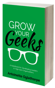
 The book jacket was striking and had tested well with Antoinette’s target audience. However, the green clashed terribly with her existing brand colours and it looked out of place on her site.
However, Antoinette had already been promoting this cover online and did not relish a book redesign: it may confuse her audience, would cost more and maybe even delay the launch.
Antoinette didn’t want a massive brand overhaul but knew she needed change to look professional and co-ordinated. However, she also didn’t want the additional pressure of overhauling all her marketing collateral before the launch in six weeks.
I therefore needed to ‘reverse-engineer’ Antoinette’s new branding to accommodate the one thing she was happy about (turning my process upside-down, but as I’d said, I like a challenge).
I promised her an “evolution not a revolution”, to start moving the brand in the right direction in a phased way and without needing to start from scratch.
To kick off, we agreed to keep the format of her logo the same, i.e. her wonderfully-symmetrical full-name format with the roundel in the middle and strapline below. This meant she would be able to use her new logo onto her ‘OK-for-now’ website or Powerpoints before the complete overhaul took place.
I’d also recommended that we keep some continuity with the bluey-purple and the grey of Antoinette’s current logo. They were right for her and her target and were already on her site (but that cyan-coloured ‘AO’ and the pink had to go!).

But how to make that bright green fit in?!
Colour inspiration can come from anywhere, but this time it was from www.colourlovers.com.

I felt this palette was pretty-much spot-on for Antoinette. Its strong jewel tones were still ‘her’, but not too ‘girly’. It had:
- A rich jewel purple (similar to her current logo)
- A strong, but warm blue
- An unusual jewel jade green (Antoinette loved that she owned dresses in all these three colours so far!)
- The bright green (like the book jacket).
- A fresh lime green for contrast.
Antoinette loved the strong colours but not the “wishy-washy” green. That was fine: we swapped it out for her original grey. I tweaked the palette to suit Antoinette more…
- The purple was now more purpley (her original logo’s shade)
- The blue a bit bluer
- The jewel green a touch more turquoisey
- The bright green made stronger, to match the book jacket.
- We replaced the offending pastel with the original logo’s grey.

The purple and blue are suitably corporate, tech-industry-friendly colours and the greens relate to growth and development. The grey acts as a neutral, ‘grounding’ the other stronger shades.
Antoinette’s palette was finally communicating how she wanted her brand to be perceived: cool, calm, collected, grown-up, sophisticated and professional. She loved it.
THE PROCESS
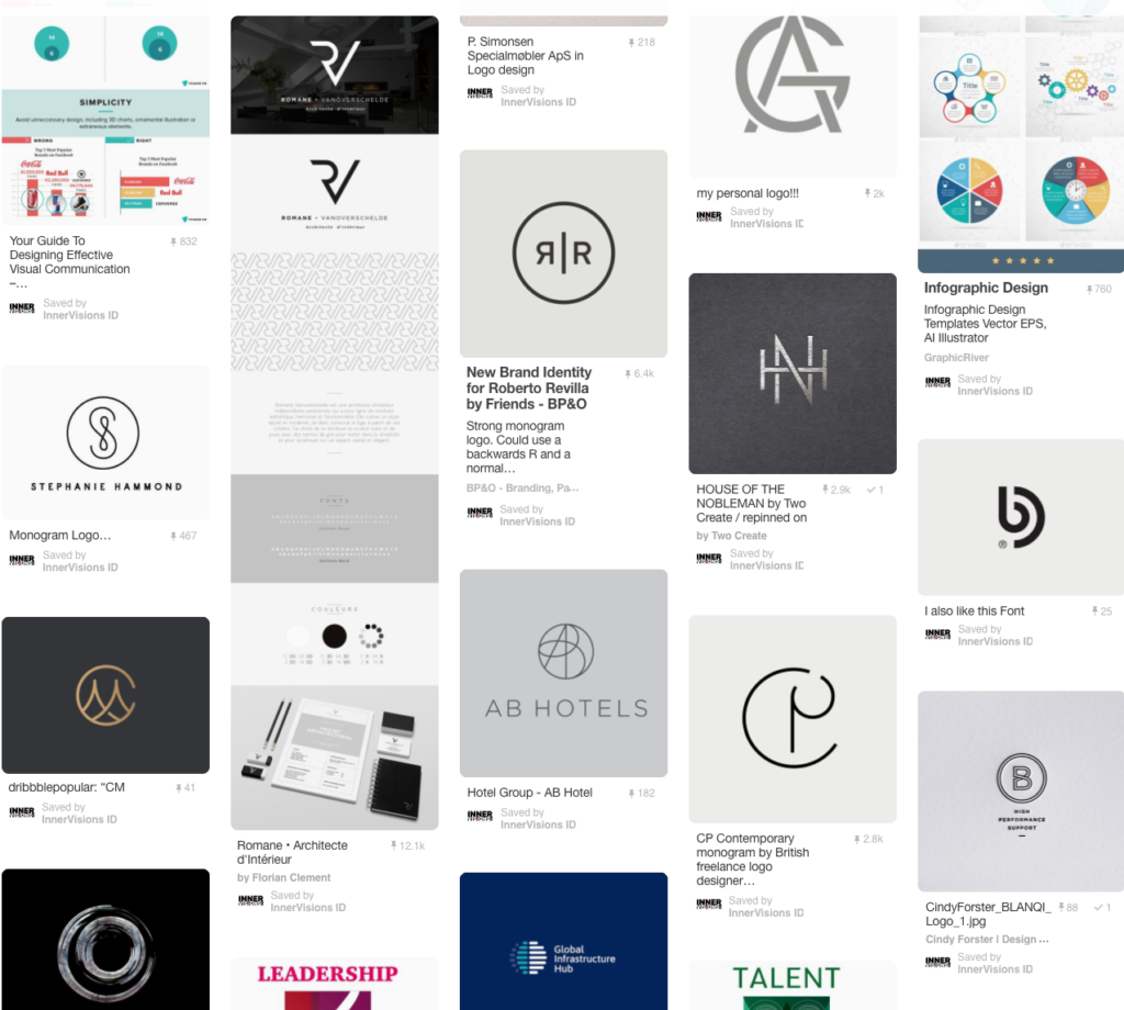
I always start by listening to my client’s problems (see part 1) and then a lot of research. In my experience, most clients don’t know what they like (or don’t like) until they see it. It’s easier to have an honest discussion around other people’s ideas off the internet (especially if they hate a concept!). It’s also a great way to explore the visual language (themes, clichés, colours) of any given industry.
Roundel. Because of her long name and logo shape, Antoinette needed a roundel she could use as abbreviation e.g. social media.
Her current roundel added nothing to her brand; it didn’t symbolise anything and looked messy in that script typeface and clashing cyan.
I therefore collated a selection of ‘monogram’-style logos to start our discussion and quickly ascertained her vision.

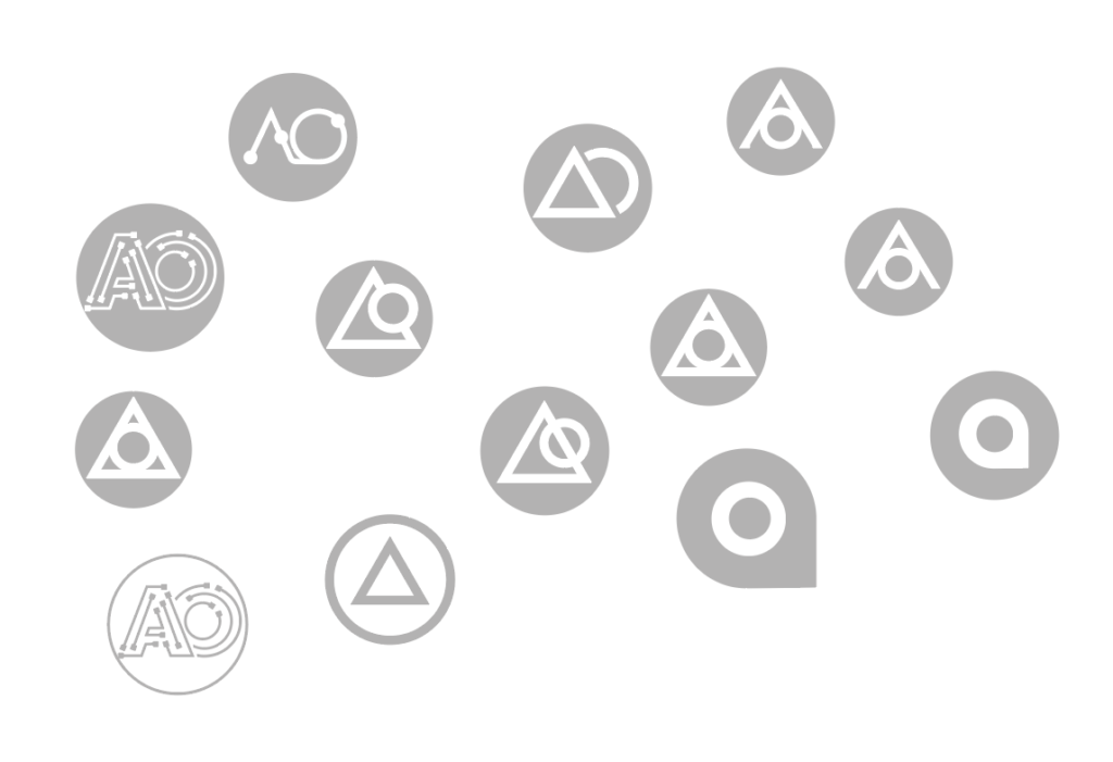
From there, I started to played with her initials. Inspired by technology, ‘doodling’ with circuitry and electrical symbols soon simplified further to a triangle (A) and a circle (O).

As I worked, a second, more exciting interpretation emerged; that of an individual (O) and a mountain (A) symbolising the ascent to leadership. We liked that.
Logo colours: Due to her unusual circumstances, colour had come before design, so I’d already decided to use Antoinette’s purple with the new ‘nurturing’ jade for contrast, grounded by the grey. The purple and jade were now her primary colours – the other, ‘secondary’ colours are there to give variety and depth to a scheme (or a book!).
Typefaces: Antoinette’s original script logo was supposed to reflect her signature, but it was dated, too casual, ‘girly’ and not considered enough to have gravitas or resonate within her high-tech industries.
As with all your branding, typefaces silently speak volumes about your business. The choice should never just be about a typeface you – or your designer – likes. You need one that resonates with your audience…

Upper & lower case or all caps? Capitals can be more ‘authoritarian’…with U&LC seen as more ‘approachable’. Whilst both had their merits, the latter seemed to sit better with Antoinette’s people-centric brand.
Serif or sans serif? Serifs can make you look more ‘establishment’, but sans look more modern. To speak to her tech-clients, we decided to narrow our search to sans faces.
We shortlisted the typeface and roundel combinations (not shown) and once we had a winner, finished by rewriting and setting the strapline.
BEFORE

AFTER

Evolution, not revolution, but a transformation nonetheless.
The new logo is sharp, more measured, elegant and contemporary. (Antoinette was delighted to find out we’d inadvertently picked the same face used by Apple and Microsoft. Clearly a tech-savvy choice!)
The palette was now cooler, more professional and industry-appropriate. Fewer colours and tonal hues made the logo immediately feel more ‘pulled together’.
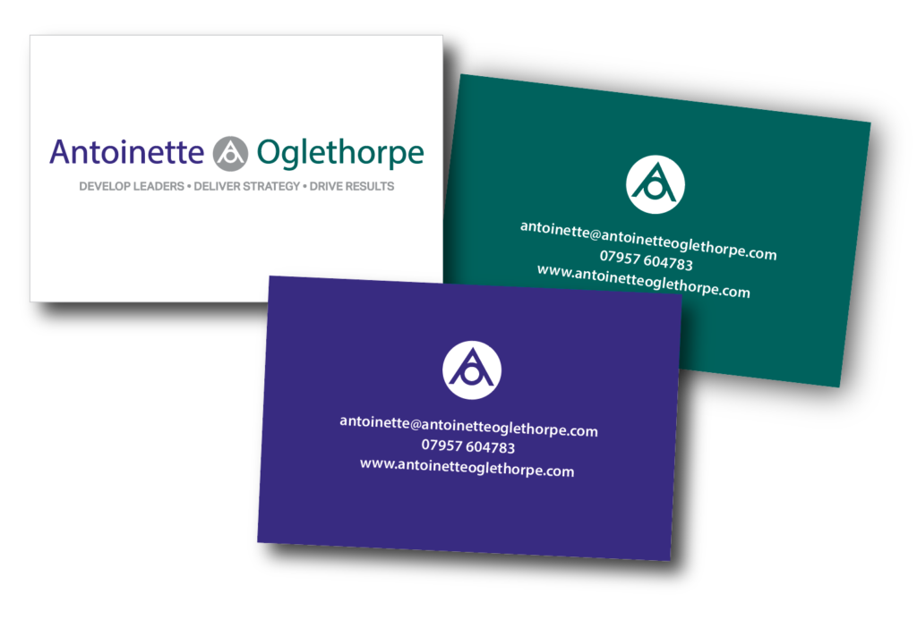
Antoinette was so thrilled with her new look, she wanted to start rolling it out ASAP. She said she “couldn’t bear” to look at her old logo any more! So we designed the business cards (with two reverses)…
 …and are now, at time of writing, redesigning her website (in the interim, Antoinette has put the new logo on her old site and changed some of the colours to match).
Next: The rebrand rolls out…
If you think your brand needs an evolution – or a revolution – contact us to book an initial 20-minute Brand Assessment. If you qualify, you’ll get a free, no-obligation written report of your branding and how you could evolve it.
