
Jan
Brochure Design: Seven Tips
Brochures are a core part of building your brand. But if I had a pound for every bad brochure I’ve seen… well, I would be lying on a beach, writing this with a cocktail at hand.
Here are a few tips to help you get started…
1. Purpose of your brochure
Establishing the purpose of your brochure really helps focus the content. What do you want people to do as a result? Keep the end game in mind as you write your copy.
Keep it simple: I once took a 16-page brochure down to 4 and it was all the more powerful for it.
In a service-based business, say, you’ll only need:
- Introduction (may be about you, your story, topline what you do, who you work with)
- A brief outline of your client’s problems (so they can quickly tell if you are relevant for them)
- How you can help them (paint a picture of their life without this problem, explain your method)
- Testimonial(s) – showing transformation is even more powerful
- What you are selling – Packages? Products? A bespoke solution?
- Next steps and contact details
2. Format of your brochure
Consider the format, shape and size. It really depends on the purpose of your brochure (and if you’re going to mail them, stick to standard sizes) but if they are to go in gift/event bags, or if you are a creative or want to make an impact for any other reason, then it may be appropriate to think outside of A4 portrait.
A clean layout will enhance legibility so don’t scrimp on page count.
White space (not necessarily white, just the term for ‘space’ in layouts) is essential to good design. It allows the reader to breathe, pause, reflect on and easily navigate sections of your brochure.
White space can also convey sophistication, calm, modernity, luxury, cleanliness, or simplicity.
It’s the difference between flying economy or first class…


3. brochure Copy
Write the copy and ask someone you trust to edit it down. Almost ALL our clients come to us with too much copy.
As a guide, write your copy, then halve it.
It’s natural (and great!) to be so passionate and knowledgeable about your business, but for a time-poor client, it’s probably a case of TMI. You need to establish the essentials and hone your message to communicate more clearly.
Here’s a guide we published on how to write kick-ass copy.
4. brochure ImageRY
The right imagery can lift your brochure from blah to brilliant and help you tell your story.
- Don’t use online images for your brochure. Print images should be 300 DPI (dots per inch), online they are usually only 72 DPI. They will print blurry. Also, if they are not your images, you may be infringing copyrights.
- Bad lighting and composition says ‘amateur’. A professional photographer can make a huge difference and need not cost the earth.
- Pictures of people really make your proposition come to life. You can stage shots with friends and use the backs of their heads in shot, with you facing the camera (like our client Ellie did here) if you need images of you working with clients but confidentiality is an issue.

Ellie Rich-Poole, The Recruitment Coach
- Tight on time and/or budget? Then consider good stock photography. Maybe have your designer do something stylistic with them to make them more bespoke to you – e.g. a tint or other effect. Warning: Stock pictures often come with a side order of cheese so avoid the obvious cliché shots. We recommend Shutterstock – or you could try some of these free sites.
Other types of imagery, e.g. illustrations, infographics, tables and diagrams can be used to clarify some of your more complex concepts and break up the copy. Patterns and icons add visual richness.
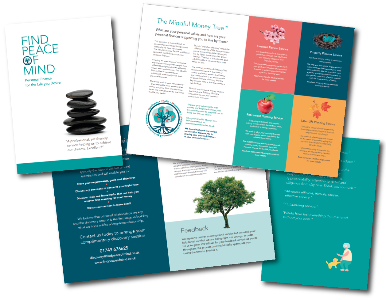
Brochure for Find Peace of Mind, independent financial planning
5. Your Typefaces
Stick to one or two typefaces with a variety of font weights/sizes for headings, emphasis, and interest.
Consider the ‘personality’ of the typeface, e.g. a serifed font (those with the little ‘feet’), is more traditional and serious – often used for legal or financial bodies. A sans-serif font gives a more modern and approachable feel. You can mix a serif and a san-serif font in the same document, (say one for headings, the other for body copy) but too many can look messy so do exercise restraint!
It is common opinion (not just mine) that there is NEVER a good use for Comic Sans (apart from in comics) as it’s just too ‘jokey’ for a business setting. And if you want a considered and professionally-designed look, steer clear of the ubiquitous MS Office typefaces e.g. Times New Roman, Arial and Helvetica.
6. Colour & space
Research shows that colours can affect yours – and your clients’ moods. Your brand designer should use colour psychology within your branding to help reinforce your values. If you are struggling for inspiration then colordrop may help – it only cites online (HEX/RGB) values but your designer should be able to find the nearest print matches (Pantone/CMYK).
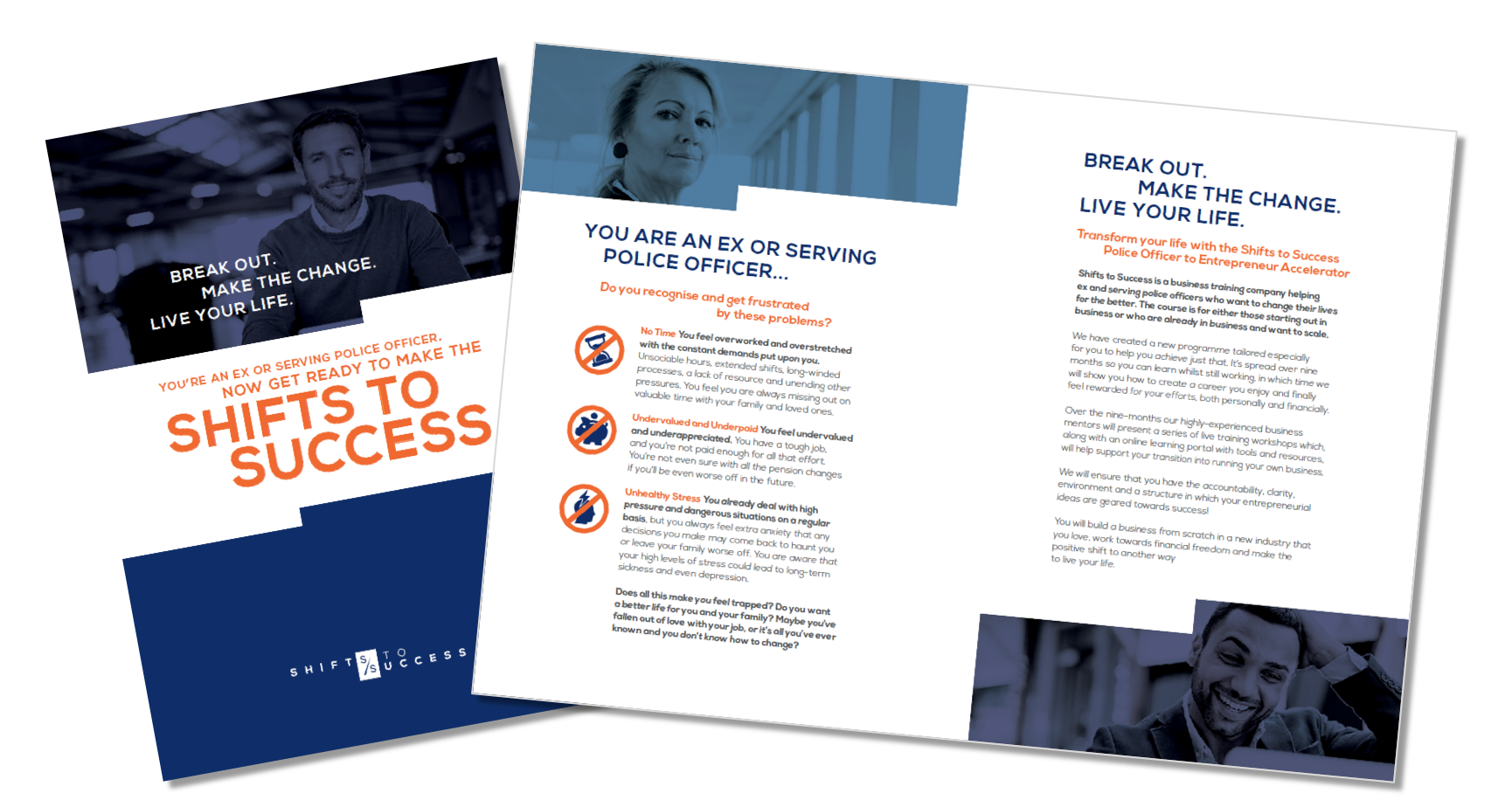
For the Shifts to Success brand palette (brochure above), we used a deep blue (to denote authority, trust) to resonate with its police officer audience, a mid blue (safety) and a lighter blue (blue-sky thinking, creativity, freedom). The orange (positive, friendly, inspires change) was used as a highlight colour and to add ‘pop’ and contrast.
7. brochure Stock & finishes
What type of paper (‘stock’) will give you the best effect? For example, A4 folded ‘door-drop’ style leaflets on a thinner stock will feel more disposable and less prestige than a high-end brochure handed out to clients at meetings. A heavier weight stock, especially for the cover, will give a quality and luxurious feel.
Crisp, smooth white papers are professional and corporate. Textured coloured papers add a tactile twist to e.g. a beauty or food-related business – whereas recycled or FSC-accredited unbleached papers will reinforce a company’s eco-creds. There are thousands of options out there so speak to your designer or printer about what you are trying to communicate.
Also ask them about different printing effects and finishes e.g spot varnishes add a pop of gloss to a page. A metallic foil, embossing or die cuts can add a real luxe touch to your brochure. (Click on any of these terms to see examples).
If you want any help with your brochure, book a free 1/2 hour Visibility ZOOM or phone call and let’s have a chat!