Jan
InnerVisions ID gets a Rebrand
We did a bit of market research when we started thinking about evolving the InnerVisions ID over a year ago. Three years previously though, InnerVisions ID the name I came up with for my interior design company (the ID being for Interior Design).
After a 20-year career spanning graphic design, marketing and advertising, and now at home with a toddler and baby, I thought that a degree in another passion of mine might turn into a new business I could build around my family.
For my final module, along with my business plan, I’d designed the logo that represents a building, with a welcoming open door…

The name, ‘InnerVisions’ (yes, inspired by Stevie Wonder’s album) was about my future clients’ dreams for their interiors being visualised, made real. My specialism was space planning for urban-dwelling families who didn’t want to have to move further out as they threatened to outgrow their homes.
ONE FATEFUL DAY…
Around the same time, a few friends and my husband, Andy were starting their own businesses. They asked me to help with their logos, brochures, websites and messaging. Andy’s brochure got held up at an entrepreneurial event – by renowned author and award-winning business coach Andrew Priestley, no less – as the ‘gold standard’ that people should aspire to…
The brochure that kicked it all off…Andy came home that day with a fistful of business cards – for me! My new business had been within me all along…this was all my career experience coming together.
My client base grew by word of mouth. Six months later, I was recommended for a project with Hackney Council…
I’d already registered InnerVisions ID as my company name, bought the domain, set up the email addresses, had a logo. There was no time to spare so I went with what I had. A change of strapline to ‘Branding that Means Business’ adapted the logo. The ID could now stand for ‘Identity’ – and the open door symbolised business coming in.
(We won the job, by the way :))
Time to change…
In November 2018, with an expanded team in place and changes afoot, it felt like the right time to smarten the brand up.
Clients told us they really liked our name because of the way we work (understanding their inner aspirations and making their visions real), so they voted against changing our company name.
Black and red are powerful, dynamic and decisive colours. Also since a stylist told me they were ‘my’ colours – and I wear red when I give talks – I didn’t want to change them either (I tried a few others just to make sure).

Rebrand development
So we kept the same name, colours and strapline for…
‘Evolution, not revolution’
This is what we mean by refreshing and building on an existing brand.
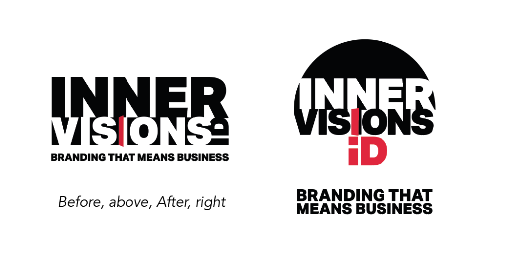
We took ourselves through our VISION Process, exploring our own aspirational brands, values and aspirations and working to increase our own stand out. So after stopping and starting the process several times over 2018 and days – of trial and error (gosh, it’s SO hard to design your own logo!) this was the final result… more modern and stylised.

The exact same font looks stronger with tighter letter-spacing and the larger ‘VISIONS’ now matches the width of the ‘INNER’. There are also some rather cool juxtapositions between the letters. (OK, I’m geeking out, but look how the gap between the E and R blends seamlessly into the N below them!)
We kept the open door and made the ‘iD’ more prominent, more stylised (a nod to the magazine!) and made it ‘pop’ in red.
The strapline is also bigger in comparison to the logo, now it runs over two lines.

The end result is a logo that’s so much more visible. Even with the addition of the circular element, the logo looks clearer and simpler, somehow.
The circular shape, hints at a head, brain or even an eye. The ‘inner’ thoughts are in the ‘head’ and the ‘vision’ develops out of that. The white half of the logo is left it for your mind to ‘close the circle’. It’s a visual representation of our intelligent, cerebral approach. (Oh, and I just love circles!)
If your brand could do with an evolution, get in touch or book a FREE 30-minute Brand Clarity call with us.
