
Dec
Just Add Colour
In 2005, in Mason County Jail, Texas, Sheriff Clint Low decreed that everything in his all-male prison should be pink – walls, bars, sheets, towels, jumpsuits and slippers.
Amazingly, aggression levels plummeted and the fighting stopped. (I guess it’s hard to act the big man when you’re dressed like a baby girl!) Inmates also felt humiliated to be seen doing community service in their town. They didn’t want to have to wear the outfits again so reoffending rates dropped by 70%.
The Power of colour
Colour has a powerful psychological effect on our emotions, moods, perceptions and our actions. If colour can have such a powerful effect on hardened criminals, think how your brand colours could affect your customers.
According to research people make a subconscious judgment about a product in less than 90 seconds, and a majority base that assessment on colour alone.
“Testers for 7-Up found consumers reported more lemon flavour in their product if they added 15% more yellow colouring to the packaging.” Malcolm Gladwell, Blink: The Power of Thinking Without Thinking
Colour also increases brand recognition by up to 80% according to a study performed by the University of Loyola.

Colour grabs your attention over black and white
A black and white image holds the attention for 0.6 of a second, but a coloured image can hold the attention for two seconds or more according to colorcom.com. Which is why we charged more for colour advetisement sites when I worked in press.
After the moody monochrome, greiges and beiges of the 1990s and early 2000s, (think Calvin Klein ads and Gwyneth Paltrow’s wardrobe) I’ve noticed that colour has been steadily on the rise since. I believe that this is a reaction to the austere and unsure political and economical times we are currently living in.
Colour brings a breath of positive energy into our world.
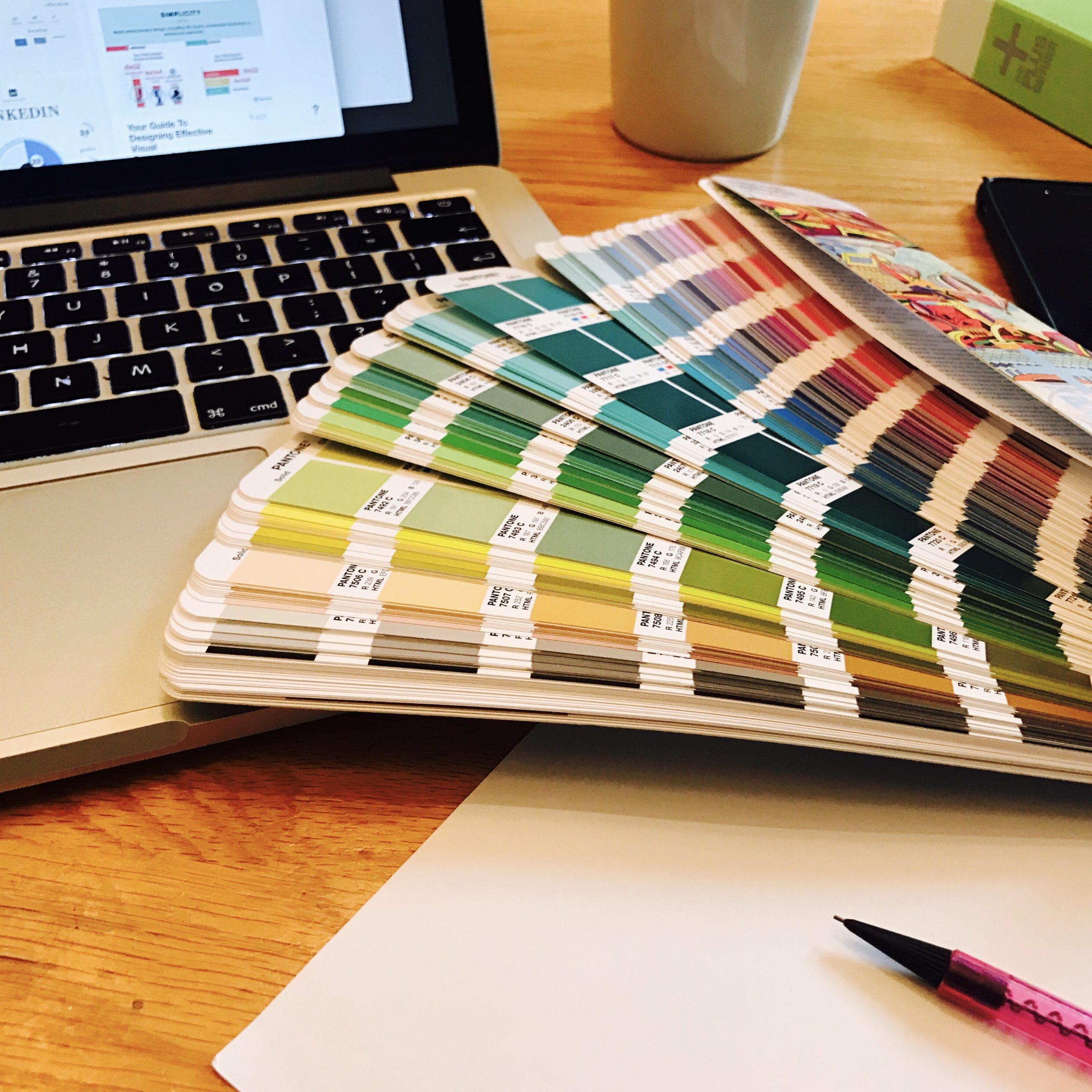
How do I choose the right colours for my brand?
It’s best-practice for your designer to design your logo in black and white first and get the form and concept right, undistracted by colour.
Your logo needs to work in monochrome (usually black, white or tints of black, called ‘greyscale’) if it is reproduced on photocopies, newspapers, merchandise or one-colour print jobs.
A lot of brands keep their logos black and white, especially product-based and luxury brands, where gorgeous product photography adds the colour e.g. Apple, Chanel, Mercedes Benz. Even brands like Adidas and John Lewis have taken this route.
However, colour, wherever it is in your branding scheme is key to bringing your brand to life, especially if you have a service-based business and beautifully-designed items are not part of your offering,
Colour Psychology
So many to choose from…
A knowledge of colour psychology will add a whole other dimension to your brand, invoking positive feelings for your target customer.
The human eye can detect 7 million different colours and different combinations will change the context and meaning of the colours you select. So don’t just pick your favourites!
Here’s a list of some basic colours and what they represent.
- Dark Blue: authority, reliability, established, masculine, corporate, has gravitas.
- Mid blue: communication, openness, trust, ambition, caring, calming.
- Paler Blue: calm, idealistic, freedom, creativity, inspiration.
- Orange: positive, attention, optimism, hope, friendly, cheerful, change.
- Turquoise: creativity, calm, harmony, spiritual.
- Bright/Light Green: organic and ‘green’, fresh, healthy, growth.
- ‘Racing’ Green: heritage, high-end, class, luxury, old-money.
- Yellow: happy, positive, sunshine, upbeat, illuminating, energetic, encourages movement.
- Red: Power, fast, speed, youthful, bold, energetic, stimulating, attention, emergency, love, passion, danger.
- Purple: creativity, imagination, royal, wealth, empathy, wisdom.
- Pink: feminine, youth, babies (pastel), sexy (hot pink).
- Brown: organic, environmentally-aware, wholesome, old-fashioned, rugged, outdoorsy, natural.
- Cream/Beige: sophisticated or high-end, but can also be seen as old-fashioned, traditional or retro.
- Grey – balanced, calm, grounded, sophisticated, modern, neutral.
- Black – luxury, strength, clarity, simplicity, timelessness, serious, formal, has gravitas.
- White (and white space) – pure, innocent, luxury, calm, clean, peace.
Of course, no colour will get the same reaction from everyone. We are all affected by our unique experiences. I had to wear a dark brown uniform and the kids from other schools would shout out poo-related insults. Clearly I now hate brown and would never entertain it for my own company branding. Colours may also have different meanings in other cultures (white, for example, is worn for mourning in India) so do research these if you are thinking of going global with your brand.
If you want inspiration for colour palettes, I highly recommend www.colourlovers.com.
How many colours should my logo have?

95% of Fortune 500 companies use only one or two colours for their logo and many luxury brands only use one. However, some global brands totally smash that rule, like Google, Microsoft and previously, Apple. Rules are made to be broken! However, if you are on a budget, fewer colours will look classy and high-end.
What is a brand palette and how do you use it?
Even with a one-colour logo a brand palette will give your branding more depth and variety. We normally look at three to five colours for a brand palette. One or two key colours and then another two or three secondary colours.
Your designer will help you choose your brand palette. You don’t have to use all the colours all the time and on every page or item.
If you have a tonal brand palette where your colours are all different shades of one colour, consider a contrasting ‘pop’ colour like we did for Shifts to Success.
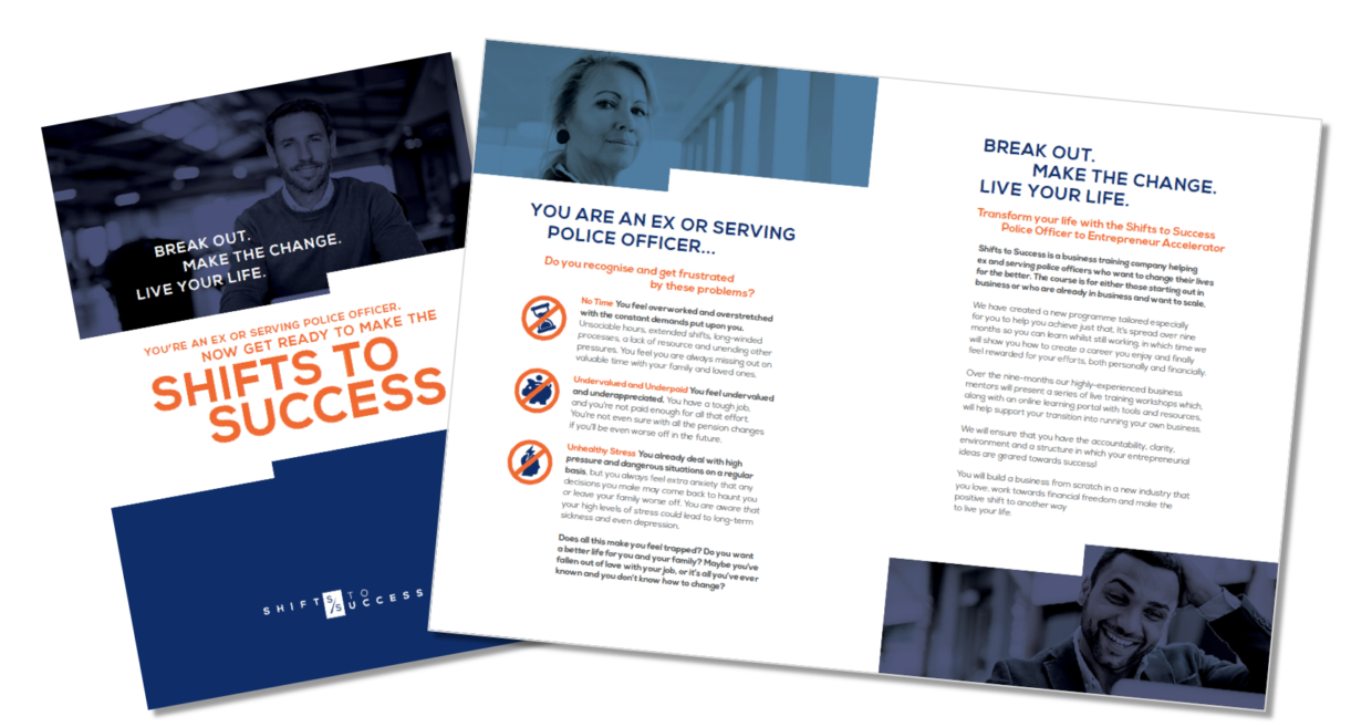
Shifts To Success Brochure
A deep blue (authority, trust, reliability, gravitas) was the primary colour to resonate with its police officer audience. Secondary colours were a coordinating mid-blue: (communication, ambition, caring, openness, trust), a paler blue (inspiration, freedom, big ideas, creativity) and orange (positive, friendly, optimism, hope, change). This ‘pop’ colour brings life to the blues and is useful for drawing attention to important information, calls-to-action or buttons on a website.
 Sapna Pieroux’s book Let’s Get Visible! gives you loads of tips on branding that means business. Sign up here to get a free sample.
If you need help with your branding, book a free Brand Clarity call and let’s see what we can do…