May
Image: The VISION Process
If you’re not standing out, you’re not being seen and if you’re not being seen – you’re as good as invisible – and you are losing sales. Our award-winning VISION Process™ is a simple six-steps to build a stand out brand.
Steps 1, 2 and 3 are here:
VISUALISE, is where you start with your big brand aspirations, then the company and customer vision.
INNER BRAND is the non-visual, heart and soul of your brand – how you make that emotional connection.
STAND OUT is all about differentiating your company from your competition and discovering your aesthetic.
The fourth step in VISION is all about IMAGE.
IMAGE
This is where all that strategy and thinking and research becomes visual and your brand’s look finally starts to come together. The ‘See’ part of your ‘DoSaySee’ is really the sexy bit for many entrepreneurs which is why they often rush to do this bit without enough planning!
There are three key visual elements of brand imagery that truly represent and reflect the brand you’re creating:
- Type
- Colour
- Imagery
Choosing the right type and colour is really important so I’ve covered them in-depth with separate blog posts here (type) and here (colour). So now it’s time to cover the third part…
Imagery
“A picture paints a thousand words”
Strong brand imagery lifts your branding from blah to brilliant. It will help build your brand with a distinctive look, and can communicate a concept, emotion, story or idea better than words alone.
Imagery includes:
- Photography
- Illustration
- Patterns, textures, shapes, symbols and icons
- Infographics, diagrams and tables
Photography
Great photography is the most powerful way to build your brand imagery so we’ll spend the most time on this one.
Never steal imagery off another website – you’ll be infringing someone’s IP or copyright. Either source from a reliable image bank or get bespoke photography. Always download the high-resolution version so you can use this in print and then ask your web developer to optimise the size for the web (make it smaller/lower-resolution) for faster loading.
Stock photography
Brilliant if you are tight on time and/or budget. I find Shutterstock excellent for the sheer variety and the affordable packages, but there are so many good, paid-for and free stock imagery websites out there now (just Google them). With the free images, do check the terms of usage – you may need to credit the photographer or site.
Warning: stock pictures often come with a side order of cheese. Try to avoid all the cringe-worthy clichés – cheesy smiles, thumbs-ups, exaggerated worried faces, punching the air or high-fiving success.
Basically anything a bit ‘David Brent’ from The Office. Other kinds of clichéd imagery to avoid include using metaphorical coastal scenery and sunrises, pictures of mountains and confusing sign-posts for any type of coaching.

Stock photography has a dark side. Seriously, how exciting can a pie-chart be?!
Most businesses are about helping people, so bring your brand promise to life with natural-looking (non-cheesy) images of your target customers looking happy and living the dream, presumably after they’ve bought your product or service.
Bespoke photography
Hiring your own professional photographer gives you the chance to tailor a set of unique images for your brand imagery, and you can feature in them too.
Do not DIY your brand shots with a phone; bad lighting or composition will just make your company look cheap and amateur. Great photography need not cost the earth and pro photographers can do miracles with post-production adjustments if necessary.
Ask for recommendations and check out photographers’ websites. Photographers, like designers, tend to specialise. For example, if you work in fitness and want fast-moving action shots, consider a sports photographer. For the events industry, see if you can get a wedding photographer (they might be cheaper in the week). If you work in nutrition, consider hiring a food photographer. They will think about things specific to your industry that more general photographers might not. Use your mood board to brief them on your brand and what you’re looking to achieve.
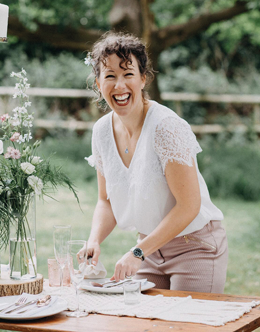
Lorna Reeves, MyOhMy Weddings. You can read all about her brand here
PhotoShoot tips
If you want to use the images on your website, ask the photographer to shoot landscape format with a lot of ‘background’ left and right. This will allow the web developer to ‘bleed’ the image right to the edges of the screen if the layout requires this, and the focus of the image should still be visible when it crops on mobile.
Aim for ten to twelve usable brand images from the shoot with similar lighting and a tonal colour palette (try weaving your brand colours in) so your photography all looks like part of a set. Include pictures of you. People buy from people, so it’s nice for potential customers to see your lovely face!
If your business demands client confidentiality but you want some pictures of you ‘in action’ ask two or three friends to pose as a ‘client’ with their backs to the camera whilst you are having a conversation with them and facing the camera.
If you’re a speaker and want more speaking gigs, book a photographer for your next event (or create an event).
Ask your photographer for landscape-format shots with plenty of background left and right for online usage, portrait-format shots and headshots. Use your new brand imagery with your brand colours and typefaces to give a coordinated look and feel across your printed and online media.
CLOTHING TIPS
Keep your clothing simple, timeless and avoid anything too distinctive, distracting, trendy, fussy, patterned or with logos on. One client made the mistake of wearing a gorgeous patterned dress for her brand shoot, but then felt she couldn’t wear it again in real life.
Also avoid white shirts with black trousers or skirts, which cut you in half and can make you look like a waiter. Unless you work in hospitality and that’s exactly the look you’re going for. In which case, fill your boots!
Feature your brand colours in your outfits, surroundings and/or your props. Bring a couple of changes of outfits, tops, jackets or accessories for variety across the pictures. Brief any ‘extras’ on the dress and colour code too. Recruitment Coach Ellie did this and used her brand colours to stunning effect for her shoot.
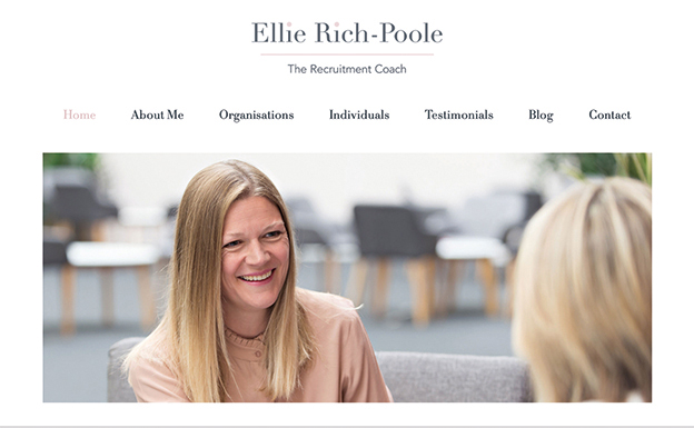

HEADSHOT TIPS
Use one headshot consistently for your business profile pictures on social media, with your bio, for press releases, on your book jacket, etc. If your look has changed, make sure your profile pictures look up to date – you don’t want to turn up anywhere and people not recognise you!
Look at the camera – eyes are important and invite the viewer in. Don’t airbrush all your little creases out – that’s character, experience and wisdom right there! I knew someone who tried airbrushing his imperfections out himself and ended up looking like Kryten (Red Dwarf fans can rejoice at the geeky reference).
Smile! It shows that you enjoy what you do. If you really don’t like your teeth, make like the Mona Lisa, all enigmatic, or ‘smize’ like supermodel Tyra Banks (look it up, it’s a thing).
Generally, colour headshots look friendlier and warmer than black and white. The only time I would choose to ‘go mono’ as standard is if I’ve got to unify several people’s headshots when putting them together in a brochure or on a website.
LOCATION TIPS
Avoid a plain-background passport-style studio shoot. Tell a story. Make a statement. Stand out!
Find an environment that suits you and your business.

Michael Coates, Combat Pest Control
If you work with food, shoot in a kitchen, a farmer’s market or an orchard. If you work with weddings, wear a ‘smart guest’ outfit and use a stunning hotel with beautiful grounds. Working with children or animals? You’re already ignoring age-old advice, so try them in your shoots (with parental/owner permission, of course) too!
If you work outdoors or with natural products, use nature’s beauty as your backdrop. Ask your photographer to shoot with a ‘shallow depth of field’ which will blur your background a bit and make sure you are the focus.

Colin Revie, Run the Day
LAST TIP: if you are mixing photography from different sources, make sure the pictures go together stylistically. Look for similar lighting, colours and settings. Your designer might be able to help by unifying them with filters, tints or pops of your brand colours, making them all black and white or overlaying graphics on top.
Illustration
Illustrations are a great way to make your brand imagery stand out by adding life and unique character. Again, you can go for stock or bespoke illustrations and use them alongside or instead of photography.
Stock illustrations come as ‘bitmap’ or ‘vector’ images. Vector images are editable so your designer or illustrator can use a section of the illustration, delete, duplicate, add to or scale elements and re-style it with your brand palette and fonts.
Bespoke illustrations for you, which is a wonderful way to ensure uniqueness as we did for Coaching Impact. We commissioned an illustrator and asked for the images to be vector ones so we could change the colours or edit them in future if needed.

Patterns, textures, shapes, symbols and icons
Patterns, textures, shapes, symbols and icons add richness, depth, variety and interest to your branding imagery. Shapes, symbols or icons will break copy up, emphasise areas or give dynamism and interest to a design and add a consistent style to your brand.

A bespoke Art Deco pattern really brought the branding scheme together for the rebrand of Centenary Lounge.
Infographics, diagrams and tables
Great infographics, diagrams or tables make complex concepts simpler, more memorable and consolidate your thinking. Your designer might create these from scratch or start with a vector stock graphic. Then they can redraw, scale, delete or add elements and customise them to fit your brand image.
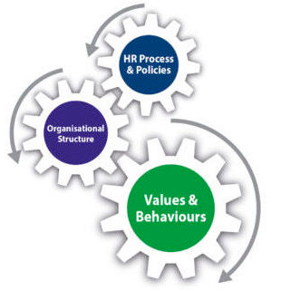
Patterns and textures may take the form of repeat or irregular, e.g. geometric spots, stripes or shapes, or more organic, hand-drawn or painterly effects. Or they could be photographs, e.g. a close up of fabric texture, wallpaper, ripples on a pond, laser beams in the dark.

If you’re using any image as a background with text running over it, choose low contrast images. Or put the type in a tinted or opaque box to make sure you can still read it.

For all forms of brand imagery, the possibilities are literally endless, so add any appealing images to your mood board and look back at your FABs for inspiration. Talk with your designer to guide you through the right options to match your brand.
My best-selling book ‘Let’s Get Visible!’ goes into more depth on IMAGE and guides you through the whole VISION Process to get brand clarity, stand out in your industry and supercharge your business growth. Buy it here.
If you want to work with us book a free 30-minute VISION call with me and let’s see what we can do…
