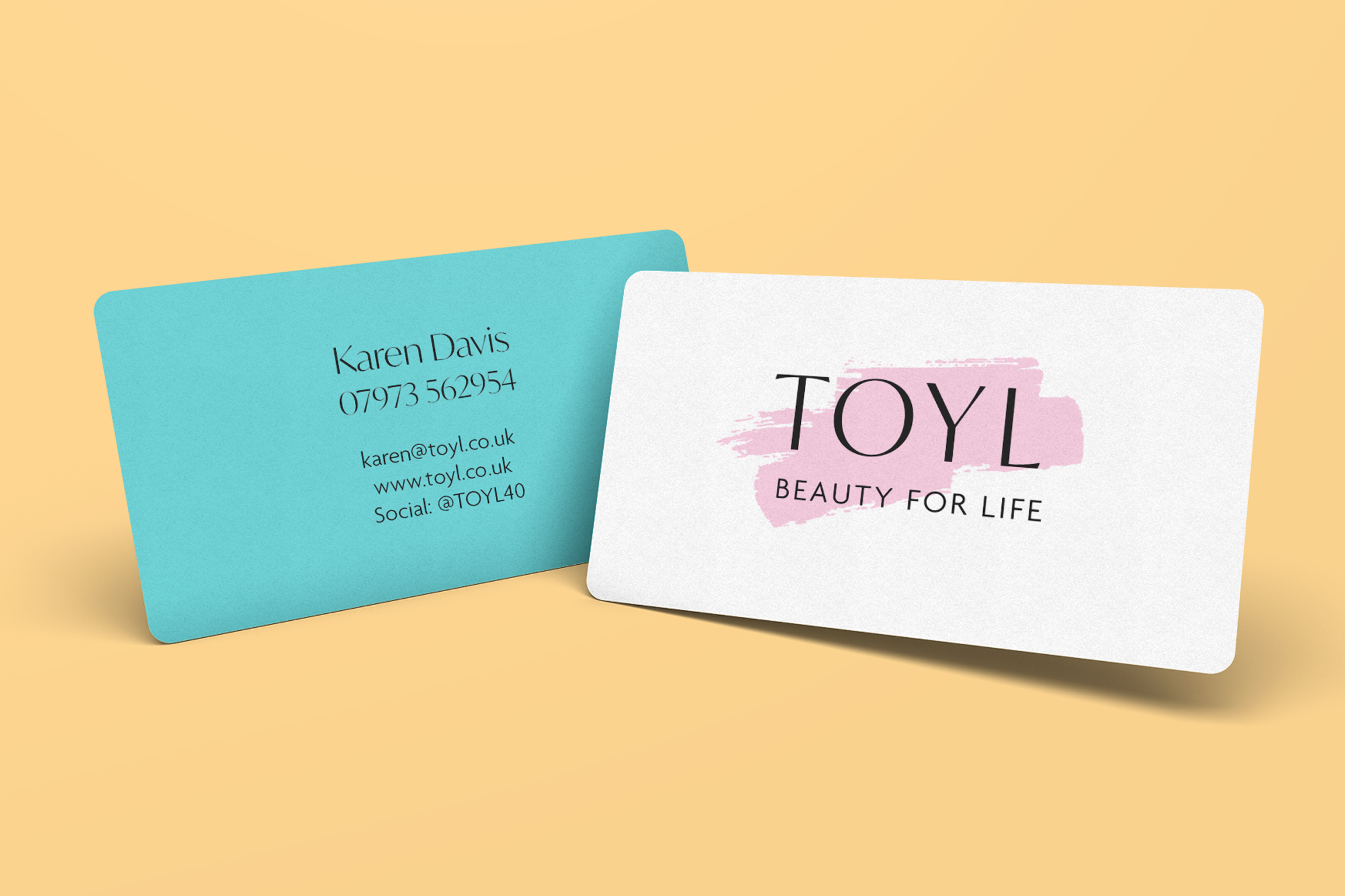
TOYL (Time of Your Life) is a beauty subscription box created for women over 40. It had been going for two years when founders Karen and Stuart Davis came to us for a rebrand.
They realised that they had several problems with their current branding and it was holding them back.
Indeed, the old brand was rather hard and masculine, with blues and neon greens and a repeat triangle pattern. The typography was similarly bold, chunky and rather butch. It all looked more suited to a camping brand than a beauty one!
The couple wanted a clear pathway for developing the brand and driving it forward to a better, more refined version.
They first booked in first for a Brand MOT where we identified and agreed the strengths and weaknesses of the TOYL brand, before developing a roadmap for the rebrand. The company name had to stay, and the photography they had was stunning, but apart from that, everything was game for a makeover.
The clarity gained in the Brand MOT allowed us to really power through their subsequent Brand Accelerator workshop.
Stuart and Karen were blown away by how much we achieved in just one day:
- A redesigned TOYL logo and social media icon – much more feminine and textural
- New colour palette using softer colours from Karen’s book and adding a pretty pink as the hero brand colour
- Graphic ‘make up’ swashes in the new colour palette (replacing the hard triangles)
- Sharper messaging: we got rid of the word ‘midlife’ and focused on ageless beauty & confidence, i.e. Karen’s brief, to “somehow convey that we are a box for women over 40, without saying it.”
- A new template in Canva for their product leaflets
- A new ‘signature’ graphic
- Business Cards
- Full brand guidelines
TOYL now looks more attractive and on-target for it’s ideal audience and has gone on from strength to strength…


