Jul
How to do a brand evolution
As your business evolves, your brand should too, not just to reflect where you are now but also communicate your vision for the future. We talk about a 3-5 year vision when we work with our clients. 3-5 years gives you chance to get well-established in your consumers’ eyes and benefit from the ROI. After that you need to look at brand evolution to keep things fresh and current.
We need consistency to build brand recognition, ‘know like and trust’, but after that time, you might start finding that…
- Your brand and branding starts feeling or looking a bit dated
- It feels like you’re outgrowing it or it may be holding you back
- It doesn’t represent you/your business are any more
- You’re not attracting the business you really want
Consistency is key, but over time change will become necessary.
If your brand needs updating but you don’t need a total rebrand, then brand evolution is the answer.
We typically start with a Brand MOT, which identifies what is working, what needs tweaking and what needs to stop. We then roadmap the timeline and process together.
Brand evolution keeps things fresh. It doesn’t necessarily mean a drastic overhaul all at once, it can be an ongoing process.
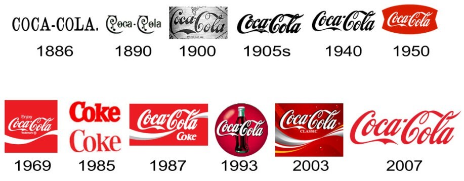
Global brands like Coca Cola, Ford and McDonald’s take this approach too…

We review our brand yearly to keep it fresh and aligned with the business and recommend you do the same. e.g. in 2020 we added the dot pattern, to tie in with the book launch.
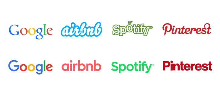
Lots of brands simplify their look for digitisation and forever-smaller screens. Mastercard recently did this too…


…and in 2022, we simplified the logo for our new website. Our strapline, ‘Branding that means Business’ also evolved to communicate better that we work on the entire brand (not just the visual aspect) to ‘For Brands that Mean Business’.

We simplified our social icon, as the brand is growing in consumer confidence and recognition. We emphasised the ‘iD’ (for ‘identity’), rotating the letters to add an element of joy to the brand. The ‘smiley face’ says confident, happy clients., that we’re fun to work with, love what we do and are friendly and approachable. One client said it’s “exactly how she felt after working with us”!

Everything else – colours, fonts and pattern stay the same.
New brand photography, also features the iconic red. The end result is still ‘us’ but fresher and bolder.
If your brand is looking tired or holding you back, why not take our Brand Quiz and find out if your Brand means Business.
It only takes a couple of minutes and you’ll get a report with tailored results straight into your inbox.
