Oct
Seven Design Nightmares …
In my time, I have come across countless design nightmares and branding disasters. I thought it might be fun to share some of them this Hallowe’en to help you avoid these seven deadly design nightmares!
You have to wonder what on earth was going through the client’s or designer’s minds when you look at these examples…
WARNING: Content is #NSFK and not for the easily-offended – or scared!
-
The High-profile Horrors
Whilst you are unlikely to be spending millions on your rebrand, it is still a significant and important investment. So it’s somewhat reassuring (in a schadenfreude kind of way) that even the biggest organisations can get it wrong.
When Thomas Cook rebranded all of their planes a couple of years ago, an open door left the company somewhat open to ridicule on social media…

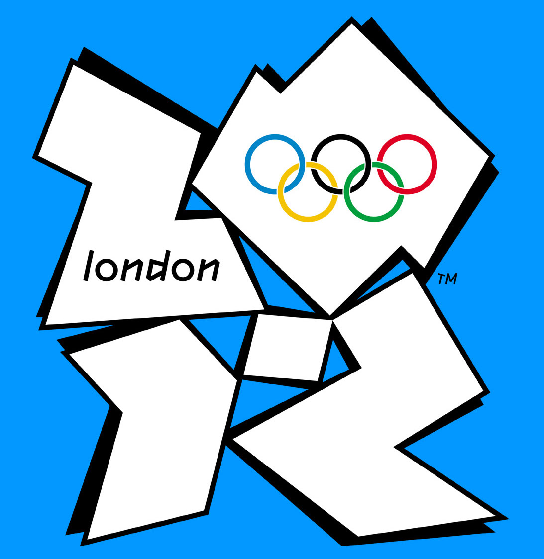
One of the most high-profile branding gaffes was the 2012 Olympics – a much-derided logo which got comparisons to Nazi symbolism, but also, Lisa Simpson in a compromising position…(now you can’t unsee that…)
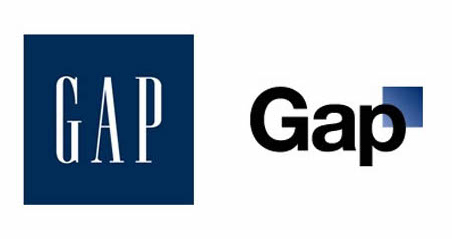
And let’s not forget the GAP horrorshow of 2010. They launched a $4billion worldwide rebrand which subsequently got ripped to shreds by both the design community (basic typeface, looked like clip-art) and GAP customers (who rather liked the old one).
Blink and you’d have missed it though – within a matter of days, GAP had gone back to its old logo and the marketing director had left the building.
2. Scary Symbolism…
Designers and brand-guardian – just take a step back to squint at the finished goods before you release them onto the world.
WHO signed these off…???
For the Catholic Church Archdiocesan Youth Commission…

the Arlington Pediatric Centre…

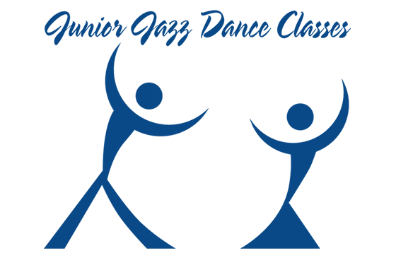
I will not be taking my kids to take these dance classes…
What about this logo, which was hastily…ummm…withdrawn after launch? Of course! It is a pagoda in front of a setting sun for the Brazilian Institute for Oriental Studies.

And I do wonder, what’s with the phallic symbolism here…
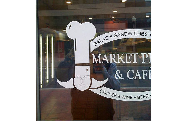
and here…???

3. Terrifying Typography
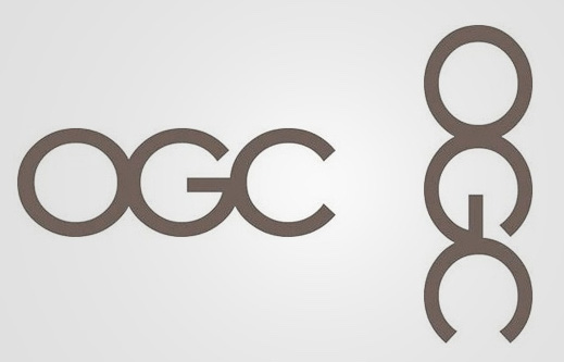
Sometimes putting letters together makes unfortunate combinations of shapes. Be sure to look at your logo from all angles (even upside down) and from far away when you have something designed.
This terrible typography led to even more phallic symbolism – was everyone too scared to say anything?!


![]()
The Office of Government Commerce spent £14,000 on this rebrand yet no-one noticed what happened when the logo was rotated until its unveiling…
I found this one in Dubai…Decisions, decisions…would you like lice or mice in your ice-cream?

4. Spooky Letter-Spacing
You’d be scared of asking for any extra treatments or upgrades here…

Space and punctuation can keep you out of trouble…

And PLEASE choose a legible typeface…

Or you may be offering more than you meant to!
5. Translation Terrors
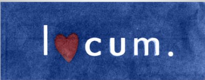
If you are going global, make sure your brand name doesn’t have any unfortunate connotations.
Pocari Sweat is one of my faves (as is sounds SO unappealing!) but I tried to find some slightly more ‘corporate’ examples for you.
This logo (sadly, now redesigned) is for Locum, a Swedish company that appear to get really excited by real estate…
Do you think this satellite company only screen scary movies?
Sadly though the classic branding cautionary tale about the Vauxhall NOVA failing to sell in Spanish-speaking countries (“No Va” means “It’s not working”) is unfortunately untrue.

But the point remains: if you have any intention of taking your brand global, do check out its meaning in other languages.
6. WTF Websites…
A friend of mine point-blank refused to click on this URL …
Say “Cheese!”…
And come ON??! www.whorepresents.com
Sadly the site, www.molestationnursery.com no longer exists but who would want to send their kids there?
Here’s a list of more unfortunately-named business websites, many of which are now sadly defunct.
Finally…
7. The (not so) Hidden Insult…
Hmmm…with a thoughtless bit of ‘crossing out’, the intended message actually reads very differently.
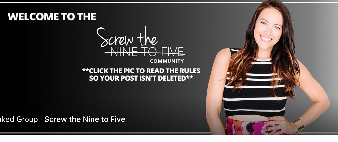
Are they really wanting to do that to their loyal followers?!
Hopefully, we’ve given you a few laughs rather than just made you shudder, but do beware – and if you want to avoid your own brand nightmares, get in touch.
Happy Hallowe’en!


