
Feb
Choosing the right typeface for your brand
Typography matters. Choosing the right typefaces for your brand is a hugely important part of the branding process – and one that’s often underestimated.
There are over 100,000 typefaces in existence, and each one communicates something different about your business. Typography affects how your brand is perceived before anyone reads a single word. While we always recommend working with a professional brand designer, this guide will help you understand the main typography styles and what they communicate – so you can make more informed choices.
The six main typeface categories
1. Serif typefaces
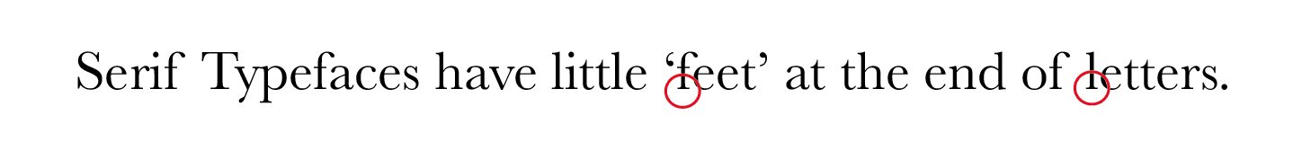
Serif fonts are the most traditional type style. Books, newspapers and magazines were historically set in serif typefaces because the small “feet” at the ends of letters help guide the eye and improve reading speed for adults. Popular examples include Century Schoolbook and Times New Roman.
Serif fonts work well for:
-
Logos
-
Headlines
-
Body copy
They’re a good choice if you want your brand to feel established, traditional, refined or trustworthy. This is why they’re often used by legal firms, accountancy practices and wedding brands.
⚠️ Be careful though – some serif fonts can feel dated or old-fashioned if chosen badly.
2. Sans serif typefaces

Sans-serif fonts are cleaner, more modern, and don’t have the decorative “feet” of serif fonts. They’re easier for younger readers and tend to perform better on screens.
They’re also incredibly versatile and work well across:
-
Logos
-
Headers
-
Body copy
Brands that want to appear modern, progressive, friendly or accessible often use sans serifs. Every major social media platform does this – partly because their simple shapes render clearly on small screens.
💡 Pro tip: Pairing a serif with a sans serif can work beautifully if you want to look modern yet established.
3. Decorative typefaces

Decorative fonts are inspired by specific eras (like the 1920s), cultural references (graffiti, gaming, sci-fi), or visual styles. They can be textured, coloured, distressed, 3D or patterned.
Used sparingly – typically for logos or short headings – they’re brilliant for setting a clear tone or mood:
-
Playful
-
Dramatic
-
Elegant
-
Retro
-
Child-like
-
Futuristic
Less is more here. Overuse will overwhelm your brand.
4. Handwritten typefaces

Handwritten fonts are very popular right now – especially among small, female-led businesses.
They can make a brand feel:
-
Human
-
Spontaneous
-
Elegant
-
Playful
But… they are a trend. And trends date.
There’s also the issue of sameness. The sheer volume of handwritten logos and Instagram quotes has made it hard to stand out.
If you’re set on one:
-
Choose something less common
-
Make sure it’s legible
-
Use it in moderation
5. Script typefaces
 Script fonts are a more formal cousin of handwritten fonts. They’re often used for wedding stationery, greetings cards and in traditionally “elegant” or feminine markets.
They can look beautiful – but they can also look old-fashioned very quickly.
Best practice:
-
Use for logos only
-
Occasionally for headings (if legible) – never for body copy
-
Never in all capitals
- Choose wisely with a modern script, not a dated one
Pair with a simpler serif or sans serif font for readability.
6. Bespoke typefaces

Global brands like LEGO, Star Wars, Volkswagen, Google, Netflix and Apple have commissioned entire bespoke typefaces. This costs a fortune – but saves them millions in global font licensing.
This isn’t realistic for most entrepreneurs. However, there is a smart workaround – you can just have a bespoke logotype designed like Coca Cola did.
We do this by modifying an existing typeface – rotating, tweaking letter shapes, spacing or other details so they becomes unique to the brand.

Before, top the brand name in the original typefaces, after bottom, once the letters have been tweaked and made unique for the brand.
Big brands do this too. The Google logo, for example, is based on a modified Futura – with changes to the ‘G’, the ‘g’ descender and the rotated ‘e’ to make it feel friendlier.

Your Typeface Represents Your Brand
Good font choices for your brand are the ones that reflect your values, vision and personality, and help you stand out in your industry.
Typefaces can completely change how your business is perceived – for better or worse.
Check these inappropriate font choices for fictional businesses.

How many typefaces should my brand use?
As a general rule: keep things simple and consistent.
Typically:
-
One or two for the logo
-
One for headings
-
One for main (body) copy
You can create variety using different weights and sizes of the same font family. This keeps things visually interesting whilst consistent.
If you want a considered look, avoid overused default, Microsoft fonts like Times New Roman, Arial or Helvetica. And PS there is never a good business reason to use Comic Sans. Trust me.
Choosing fonts that work together
Search terms like typeface pairings, font combinations or typography inspiration will give you plenty of ideas (Pinterest included). Bring these to your designer and discuss suitability.
Pro tips:
-
If one font is distinctive, keep the other neutral, if one is heavy, make the other one lightweight.
-
Avoid visual clashes – e.g. a script font and a decorative font, or two very heavy fonts
- Contrast is good. My entire book was set in two fonts: Aktiv Grotesk XBold (for headings) and Light (for copy)
Rules are, of course, made to be broken (but it helps if you know the rules!) and the choice of typeface will vary the effect you get, so try out your company name in different cases and typefaces and see which looks and ‘feels’ most right.
Also ensure your fonts are licensed correctly for both print and digital use. Free fonts exist, but many require licences. We always recommend sourcing fonts properly to avoid legal issues.
Find compatible MS-office fonts so you can produce Word and PowerPoint documents that still look ‘on-brand’. Although we don’t recommend these fonts for professionally-designed assets, it does mean these will still read OK when sent to others who don’t have your brand fonts.
Typeface case: Upper, Lower or Mixed?
 ALL CAPS look more authoritative, masculine and strong in ‘bolder’ typefaces or elegant, lofty and high-end in lighter fonts.
![]()
 all lowercase looks modern, friendly, approachable, non-threatening, feminine or gentle. Popular with tech and millennial brands to look user-friendly.
![]() Upper and Lower case are less distinctive, but safe and broadly appealing.
Upper and Lower case are less distinctive, but safe and broadly appealing.
![]() mIXinG cAseS uP Quirky, playful and off-beat. Really stand out.
mIXinG cAseS uP Quirky, playful and off-beat. Really stand out.
See the one we did below, which proves rules are made to be broken!
![]()
Final thoughts and reading
I’m such a type geek I could go on, but if you want to dive deeper into branding, typography and visibility, check out Let’s Get Visible! available on Amazon
I also recommend
- Stop Stealing Sheep by by
- Just my Type by Simon Garfield
- And Why Fonts Matter by Sarah Hyndman
Or fast-track your type knowledge with me…book a Brand Clarity Call here.
To visibility – and beyond!